
The more devices on which your site works well, the higher your SERPS (search engine results pages) rating will be. The more devices your site performs responsively on, the better for your website rankings in the search engine results pages, or SERPS.
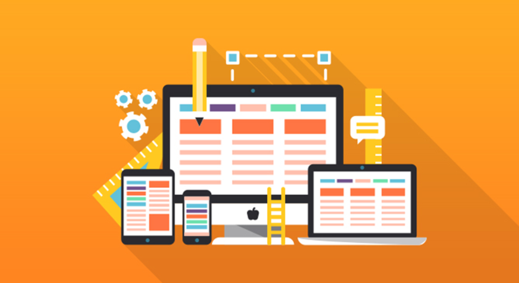
Responsive web design, or RWD, is vital for more than just content or marketing strategies; the more devices your site performs responsively on, the better for your website rankings in the search engine results pages, or SERPS.
Contents
Web Design Responsive
The more devices on which your site works well, the higher your SERPS (search engine results pages) rating will be.
RWD is also critical for increasing user engagement, but it’s not always simple to create and maintain, and errors are common.
What Mistakes Should Be Avoided in Responsive Web Design?
If you’re disappointed because your website’s traffic isn’t what you expected and you’re not sure why, the tips below will help you learn from your mistakes and give your website and brand a much-needed and well-deserved boost.
The use of large media elements:
Users in areas with limited network coverage or who are using a device with less physical memory can experience slow page loading times if your website contains a lot of high-resolution images and/or video content.
The average time spent on a website by an internet user is less than sixty seconds, and they use that time to decide whether to continue searching or abandon their quest.
A slow-loading website would not entice visitors to linger, and if it takes more than a minute to load, you risk losing traffic and, as a result, sales; in the worst-case scenario, it may spell the end of your company if not handled immediately.

It’s important to think about a website’s entire design from the perspective of users, and this should never be overlooked, particularly when designing a responsive website that can be accessed from a variety of devices.
A navigation bar cluttered with menus and subitems on a laptop may be easy to navigate, but on a mobile device with a smaller screen, users can find it confusing and difficult to use effectively.
The consumer will almost certainly give up after scrolling through the many menu items in the navigation window and go to another site that offers the same or similar products and services, and you will lose out on their potential business.
Touch features don’t work effectively:
When viewing a website on a mobile device, the press, hold, swipe, tap, and zoom effects sometimes don’t work, if at all, and users aren’t often able to click on the appropriate buttons due to their small size. While this might not seem to be a major issue, it may cost you valuable traffic and customers.
When creating responsive websites, many designers neglect to opt for consistency across a
a variety of different formats, ignoring the fact that different screen sizes and devices necessitate different navigation methods. Another aspect that can push users away and reduce traffic is whether a website does not maintain consistency.
Too much information crowding the Site
Complex UI components, such as multi-level forms, data tables, calculators, and advanced search forms, are common on websites, and these can easily trigger problems on a small, 6-inch computer.
That much material would simply not fit on smaller computers, so it must be effectively obscured to avoid obstructing the user’s experience.
Unclear Images
Images on a website should be transparent and easy to see anywhere they are viewed, and the scale should be appropriate for the computer being used. Images that are too large or small can make a website look unprofessional, as well as discourage users and make them have a negative experience.
Designers must use proper photos with decent sizing and plain text when designing a fully responsive & visibility website.
Linking to non-mobile-friendly websites
It’s easy to ruin a user’s experience when they visit your website if some of the links on it direct them to places that aren’t sensitive, or mobile-friendly, in other words.
Not understanding the client’s requirements
This is a common mistake made by unprofessional web design agencies with little experience, and it can lead to major errors when building a website.
Failure to understand or ask the right questions of clients in order to build a sensitive website that fits their target audience is an issue that can easily be avoided by communicating to clients in depth and ensuring their needs are addressed before a site goes live.
Screen sizes are not accounted for
Device specific media queries used to be useful when there were a small number of mobile devices; they will function with the iPhone, Samsung Galaxy, and iPad, to name a few; but, with new devices being released on a regular basis, this quickly becomes troublesome.
Nowadays, screen sizes differ greatly, and websites that once worked well on an iPhone no longer do so and cannot be properly viewed.
When designing a responsive website, screen sizes must be taken into account, and a competent web design firm Toronto can ensure that the site runs flawlessly on a range of platforms and screen sizes.
Responsive web design
Responsive web design is a must-have nowadays, and if you want your company to thrive online, your site must work well on any platform. If you overlook this aspect or make any of the above-mentioned mistakes, it could spell disaster for you, your brand, and your business.
Using the services of a competent web design firm Toronto is one of the easiest and most effective ways to ensure that your website is sensitive – and to avoid any of the potentially costly errors listed here – and to avoid any of the potentially costly errors mentioned here.
Your site will be in good hands with their experience and technological know-how, and you’ll soon be able to reap the benefits of increased traffic and a higher conversion rate.